DEX Trading Infrastructure Dashboard
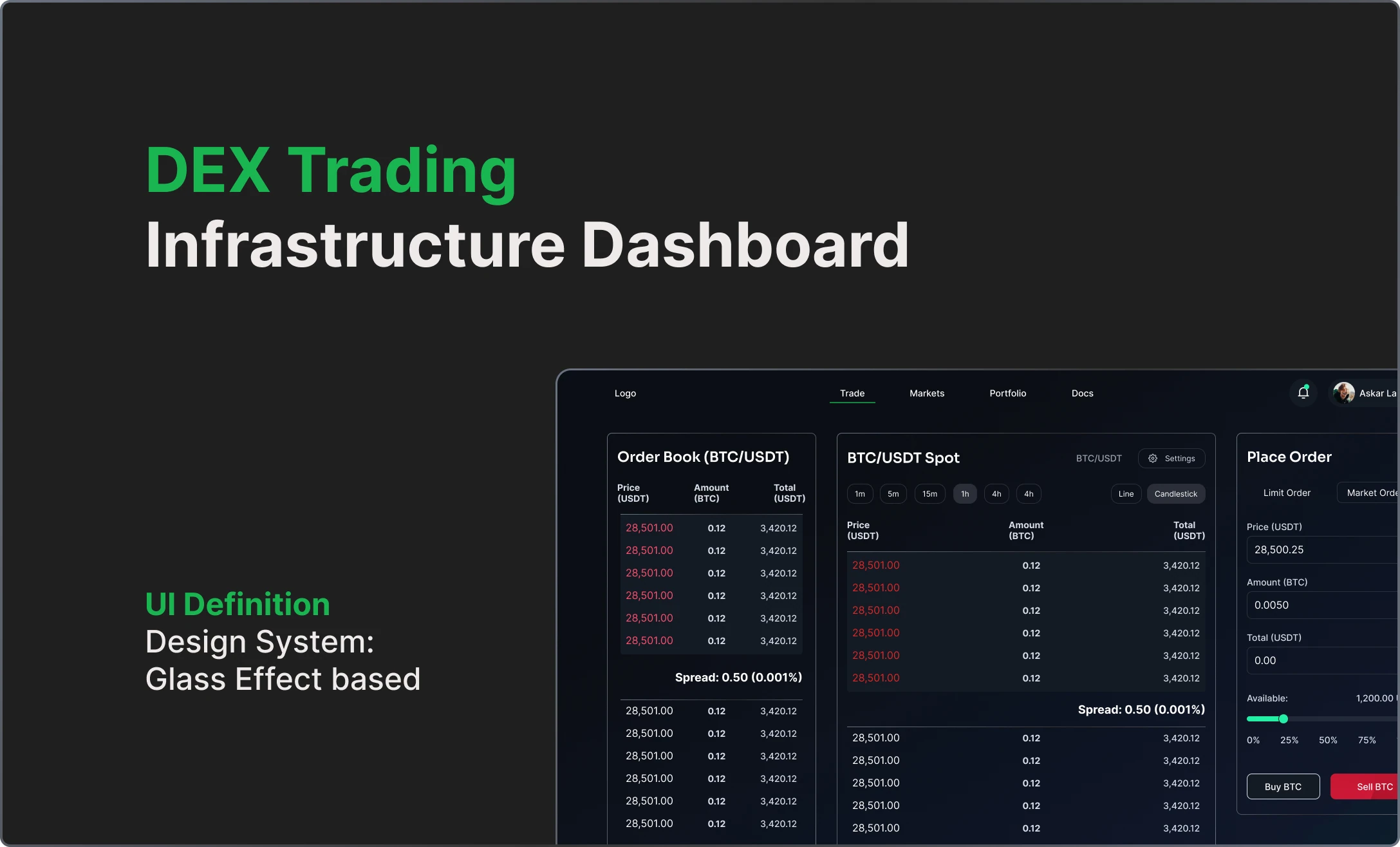
Design of a real-time trading and liquidity analytics dashboard for decentralized exchanges, translating complex blockchain data into actionable insights for traders and analysts.
Context & Problem
Traders needed to make fast decisions, but important data was spread across multiple platforms. From research and stakeholder workshops, we learned traders scan for signals instead of exploring menus. I helped redesign screens and flows to make signals clear and actionable, and updated the design system to ensure consistency across dashboards.
↓ 30–40%
faster time to insight after dashboard adoption
High
cognitive load due to fragmented data
3–5 tools
required in previous workflows
My Role
Contributed to the design of a trading analytics dashboard, focusing on solving complex data interpretation challenges through practical screen design and establishing scalable foundations via a reusable design system.
- Translated complex blockchain and trading data into scannable UI patterns
- Helped define key product challenges around data clarity and decision-making speed
- Redesigned components and contributed to a modular design system for consistent, reusable UI patterns
- Collaborated with engineering and data teams to align design decisions with technical constraints
Project Gallery

Process
Discovery
- Mapped key trading metrics (liquidity, volume, slippage, execution)
- Collaborated with domain experts to understand DEX mechanics
- Identified a core insight: traders prioritize speed and signal detection over deep exploration
Definition
- Prioritized core needs: scanability, comparability, and real-time feedback
- Defined a clear data hierarchy to surface high-signal metrics by default
- Made intentional trade-offs by limiting visible data to reduce noise and cognitive load
Design
- Redesigned dashboards and key screens with reusable components
- Created high-density layouts optimized for rapid visual parsing
- Balanced flexibility vs clarity by constraining customization in early iterations
Validation
- Tested layouts with traders to validate scanning behavior
- Iterated on hierarchy to reduce time to key insights
- Refined data grouping to better match user mental models
Design Principles
Design for scanning, not reading
Users need to detect patterns and signals in seconds.
Clarity requires subtraction
Removing non-critical data is essential to reduce cognitive load.
Consistency builds trust
Standardized data patterns reduce interpretation errors in high-stakes decisions.
Results / Impact
The dashboard helped transform fragmented workflows into a more unified decision-making experience, improving both speed and confidence when interacting with DEX data. Redesigned screens and consistent visual patterns made key signals easy to detect.
- Reduced time to identify key trading signals by ~35%
- Decreased reliance on multiple tools by consolidating workflows into a single interface
- Improved decision confidence through clearer and more consistent data visualization
Reflection & Learnings
- —In complex domains, what you choose to hide is as important as what you show
- —User behavior (scan vs read) should directly shape layout and hierarchy decisions
- —Design systems are critical for scaling data-heavy products consistently
Tools & Methods
Next Project
Radiance — Platzi App
A UX/UI redesign of the Platzi app to address critical issues: low conversion rates, high uninstall rates, and unclear learning guidance.