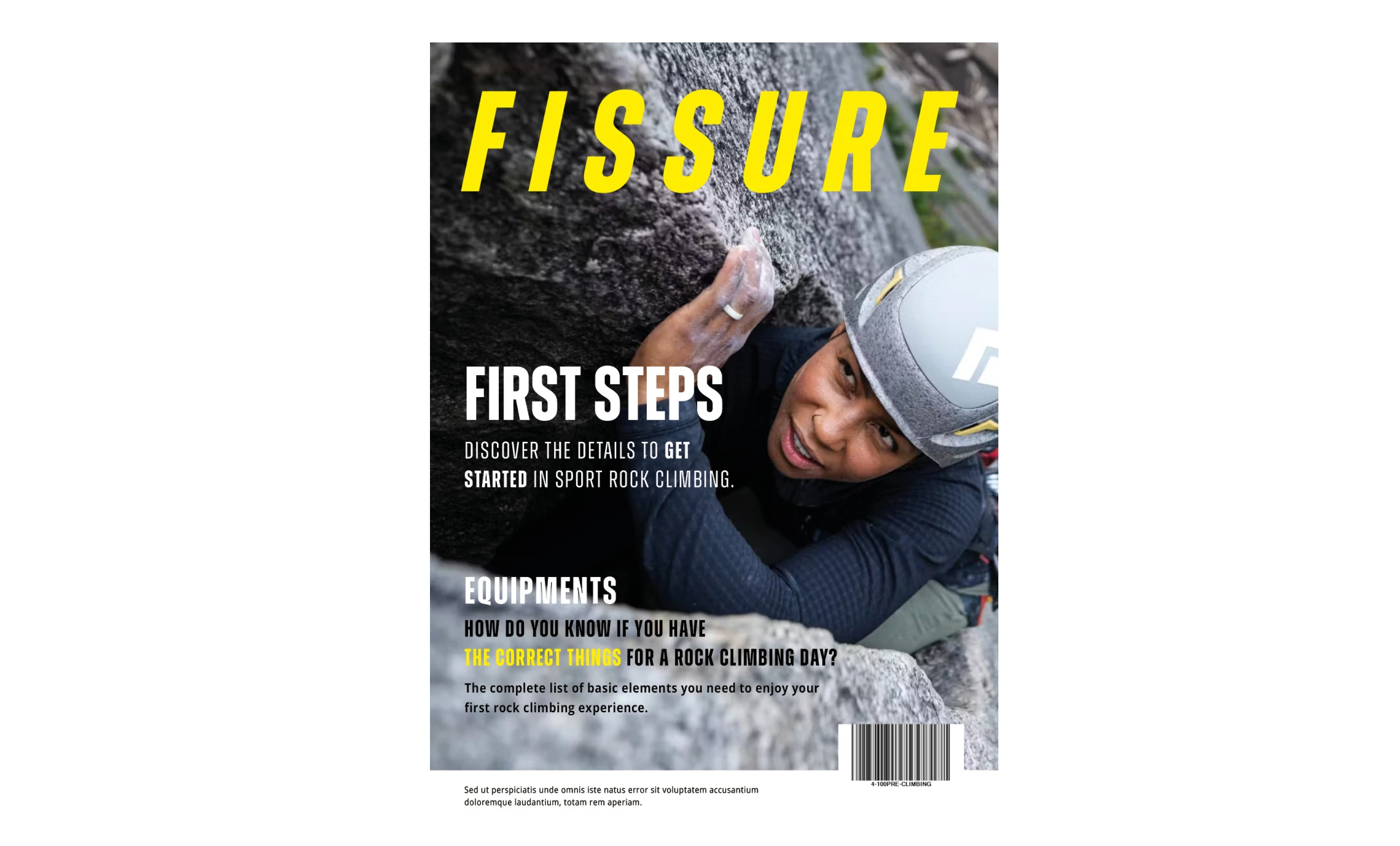
Editorial Design — Climbing Magazine
Graphic and layout design for a climbing magazine, balancing strong visual identity with editorial readability.
Context & Problem
A climbing magazine needed consistent visual direction that elevated the editorial content without overshadowing it. Each issue required a unique visual treatment while maintaining brand continuity.
Clear
Visual Guidelines
Monthly
publication cadence
Print+Digital
dual format delivery
My Role
Graphic Designer responsible for layout, typography, and visual consistency across issues.
- Visual definition and layout design
- Typography and grid system management
- Cover concept and photography direction
- Digital adaptation for online edition
Project Gallery

Process
Concept
- Editorial brief review
- Visual theme development per issue
- Cover concept exploration
Production
- Layout and typesetting
- Image editing and color correction
- Print-ready file preparation
Design Principles
Content first
Design serves the story, not the other way around.
Typographic rhythm
Consistent yet dynamic across every page.
Visual surprise
Each issue earns a second look.
Results / Impact
The magazine maintained strong reader loyalty and consistent visual identity across all issues.
- Consistent brand identity across issues
- Increased newsstand visibility through strong cover design
- Smooth transition to dual print and digital formats
Reflection & Learnings
- —Editorial constraints breed creative solutions
- —Typography is the invisible backbone of editorial design
- —Rhythm and consistency matter more than individual flashy spreads
Tools & Methods
Next Project
Christian Clothing Brand Identity
Complete visual identity system for a Christian clothing brand, from concept to execution.